Since this site was about Survey Trucks, we chose colors that would be familiar: blue, gray, and the construction yellows and oranges. It’s a rather bright combination, but does attract attention. If Gary wants, it is very easy to change the color scheme.
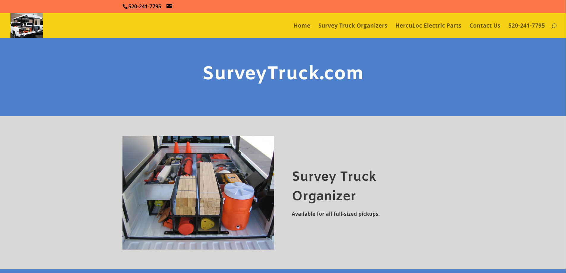
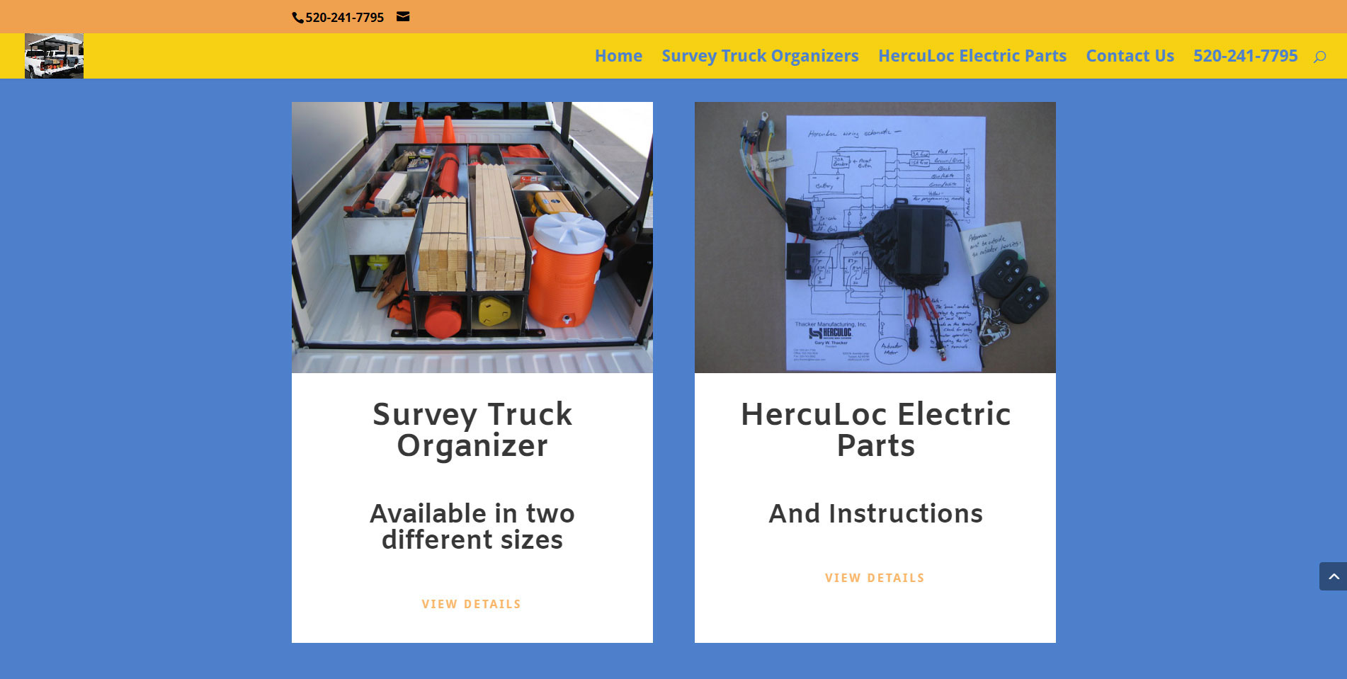
The Home page has two rotators: one for each of the products he promotes. The rotator is interesting, without having too much text.
Below the rotator is an introductory paragraph about the tonneau covers and links to the parts page.
Since many people tend to skip over text and look solely for products. And because this is a products website. We repeated the products that Gary carries. There is space here for more products, should Gary want to expand in the future, As you can see, the menu scrolls down the page.
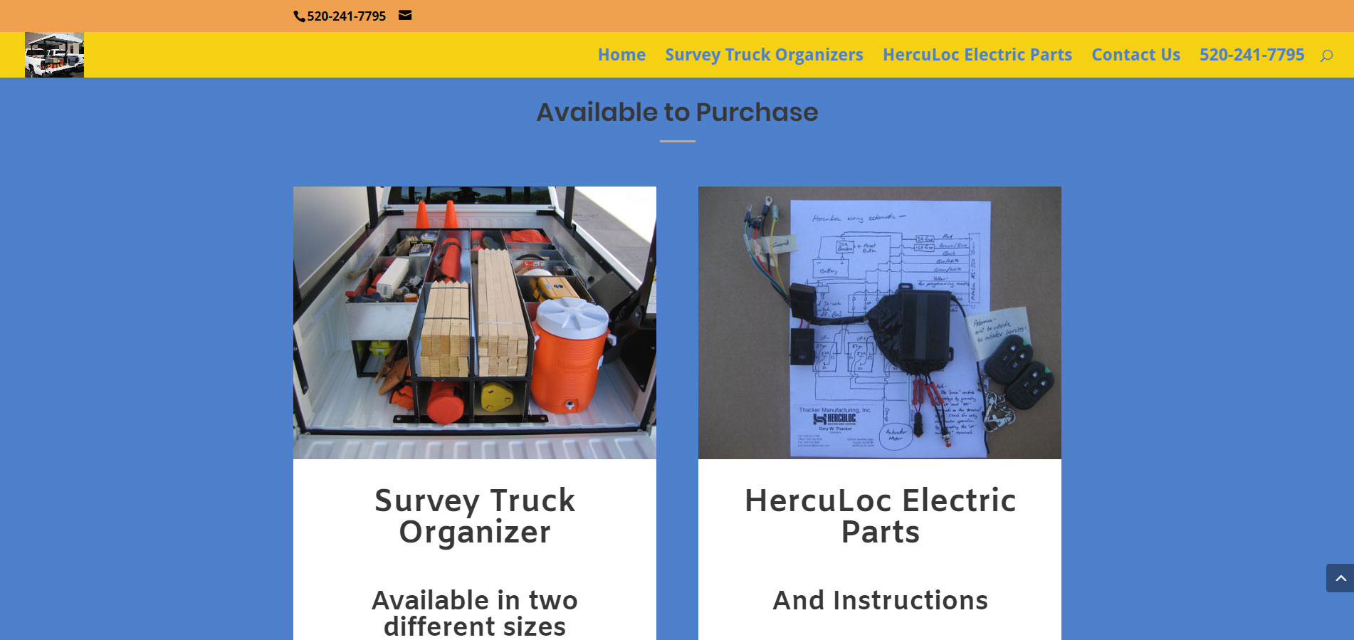
The viewer can click on the images or the text to get to the product pages. These sections also follow the color scheme, which ties the page together.
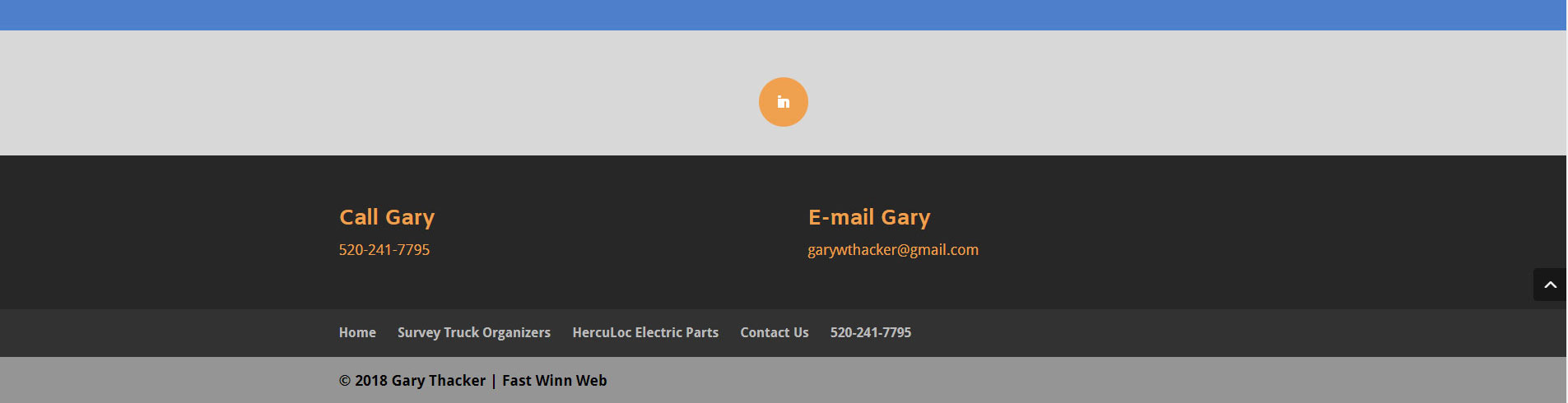
There’s a return-to-the-top arrow for a quick return to the top. Then the footer on the Home page repeats the menu, has Gary’s phone number and his LinkedIn page.
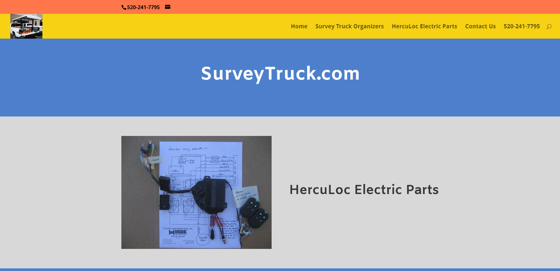
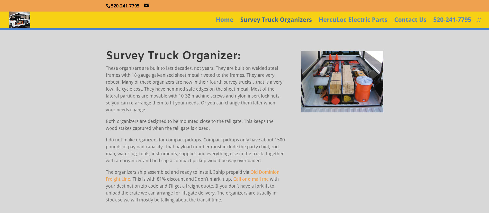
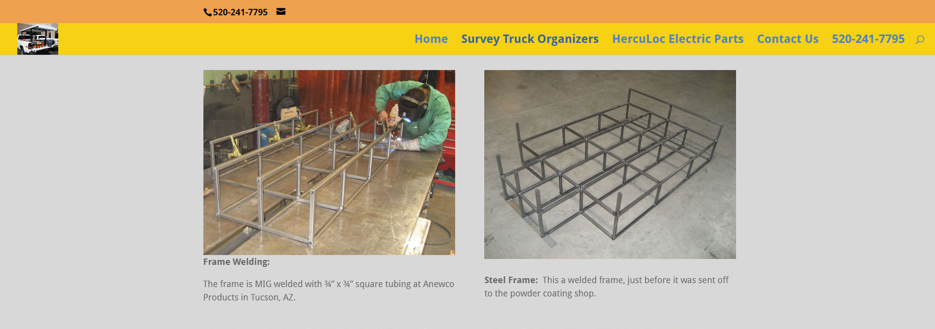
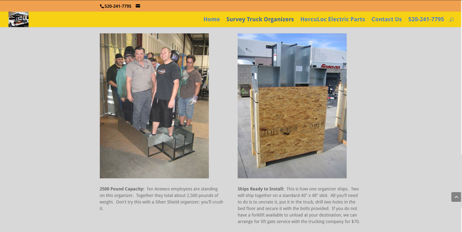
While it’s a short Home page, Gary really wanted the traffic driven to his other pages. The Survey Truck Organizer page, below, has a static slider at its top, then sections below that about the organizer, its manufacture, its schematics, and other details that a customer wants to see prior to purchase.

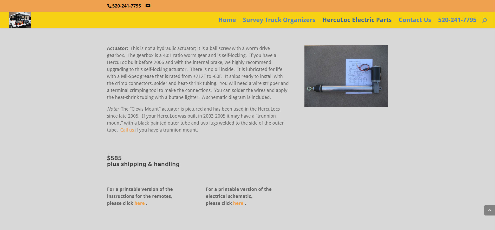
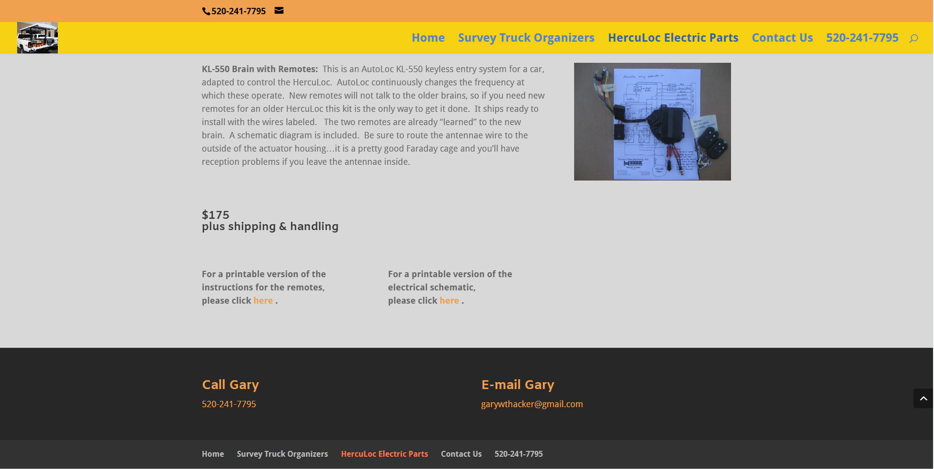
We linked these schematic images to their printable versions (pdfs), so one can download them for a more close-up view.
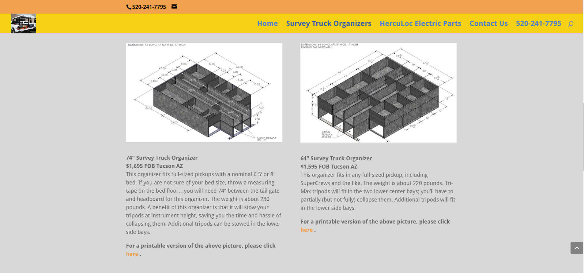
The images are all large size for good visibility, yet they all appear uniform in size. That’s the professional touch that makes FastWinn Web’s designs stand out.
This page also has a back-to-top button.
The footer highlights to show you which page you’re on, and again gives contact information for Gary.

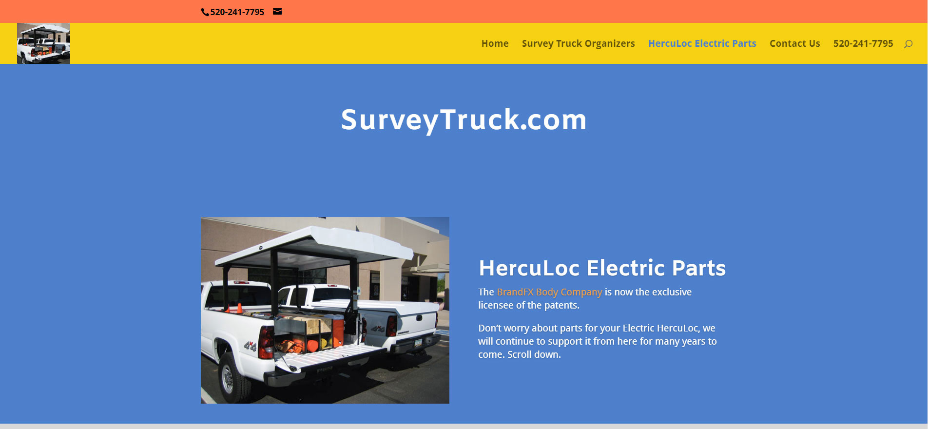
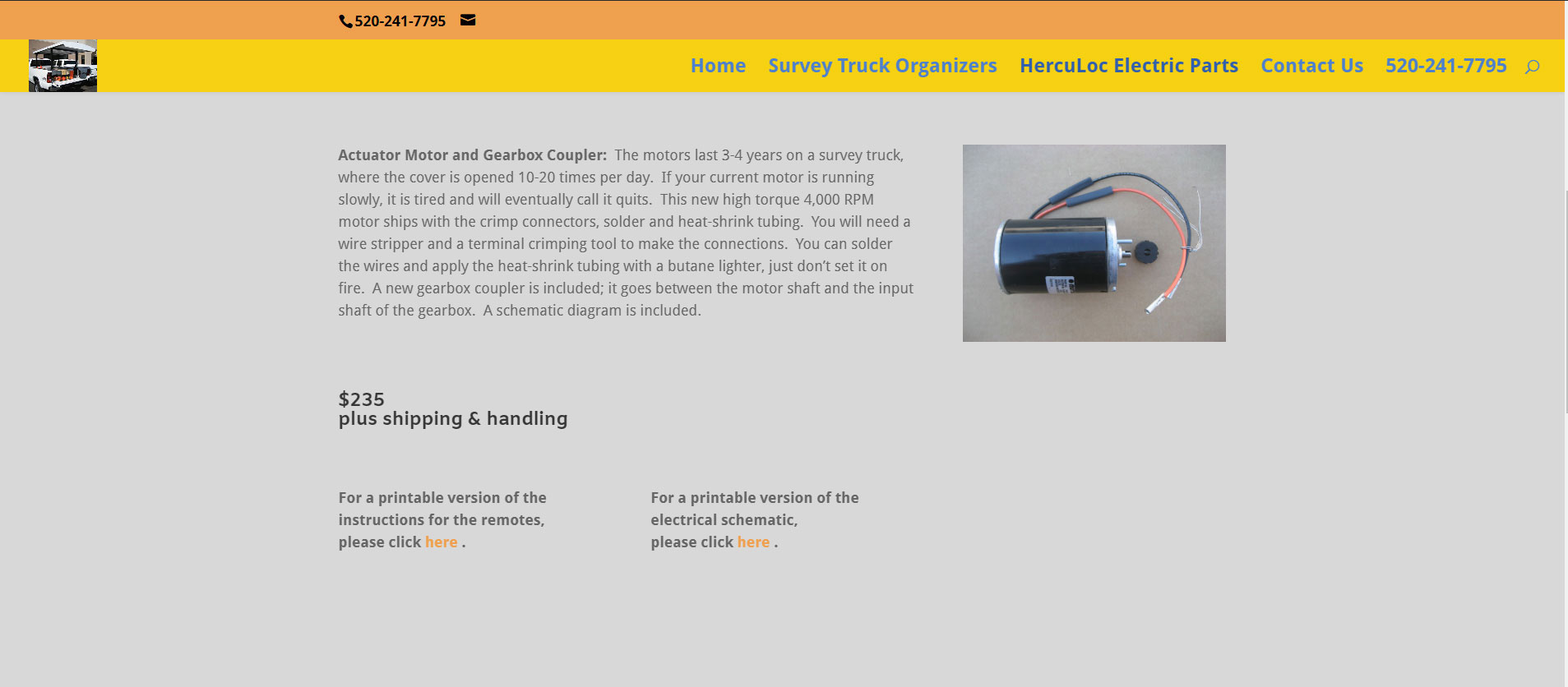
This format repeats on the HercuLoc Electric Parts page. Google gives better ranking to pages that follow a regular format. And regular formats are better for all search engines.
When it comes to product pricing, the dollar amount stands out clearly, but is easily editable.
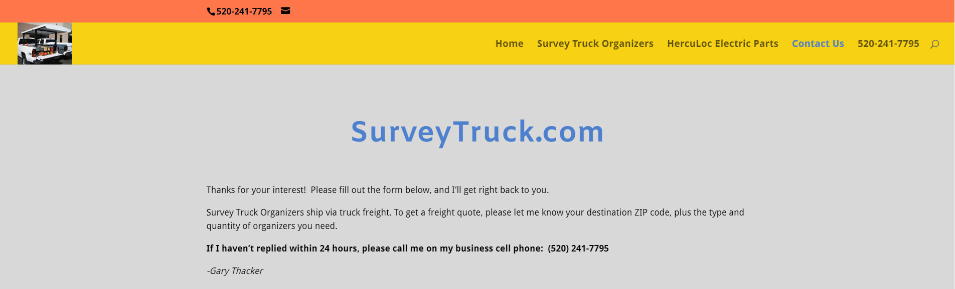
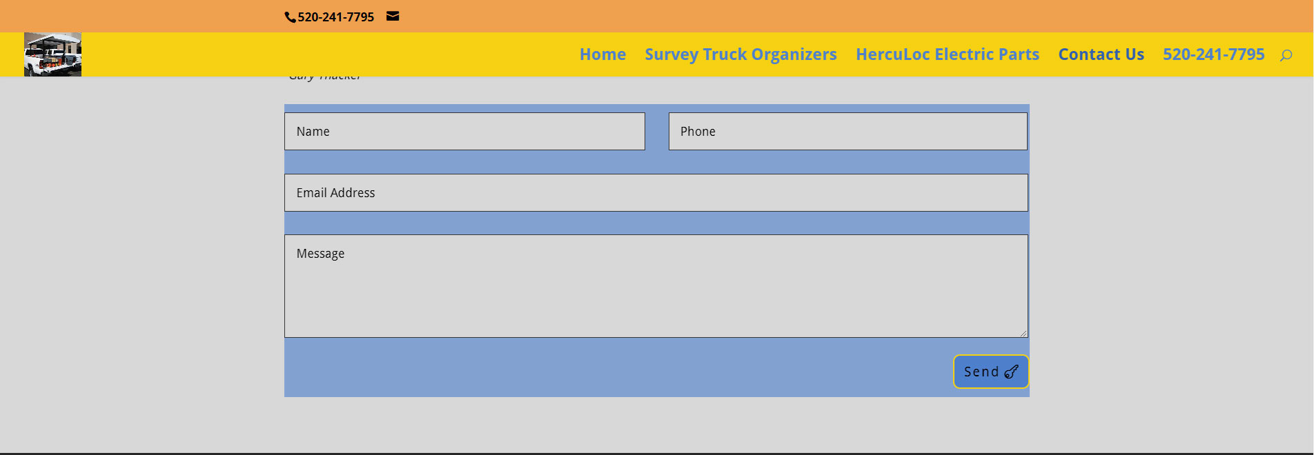
And that brings us to the Contact page. This has a different version of the color scheme to make it stand out a bit.
But it was a bit static. We animated the first appearance of the form. The send button also changes color when one hovers over it. Subtle little touches like these add that final great impression to our website creations.

What can FastWinn Web do for your products website? Contact us today!
Nifty Site Stuff
Classic Package
Home Page – rotator
Animated Contact Form
Ready for expansion
Ready for E-commerce